Statistical
The Statistical family contains 20 renderer-backed chart variants. Use this page as the entry point for choosing the right variant, then open the variant page for the screenshot, data shape, Rust API notes, and example code.
The chart family is still ordinary Fission UI. Each variant is constructed from typed Rust data, participates in layout and theme decisions, and can be driven by app state, reducers, resources, jobs, or services just like any other widget.
Variants
| Chart | Data shape | Use when |
|---|---|---|
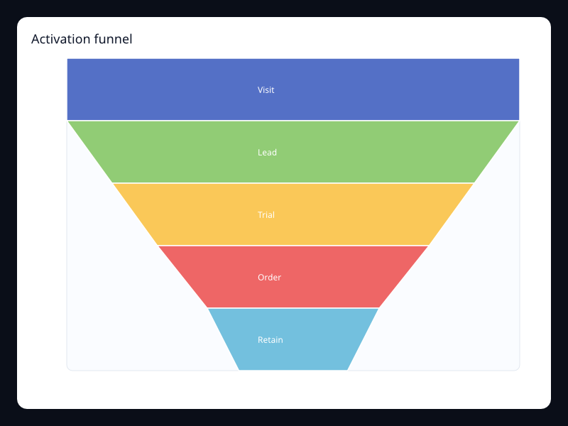
| Activation funnel | Ordered conversion stage values. | Use it when conversion loss matters more than a shared axis. |
| Alert hotspot scatter | Selected alert points over numeric axes. | Use it when only important events should pulse visually. |
| API latency boxplot | Five-number summaries across service groups. | Use it to compare distributions instead of averages. |
| Crypto session candlestick | OHLC values over intraday buckets. | Use it when price direction and range must be visible together. |
| Customer value bubbles | X, y, and value triples for customers or segments. | Use it when business value should influence point size. |
| Device quality parallel | Rows of comparable numeric dimensions. | Use it when each item has several independent measures. |
| Efficiency frontier | Efficiency points over value axes. | Use it to identify leading and lagging points. |
| Equity session candlestick | Open, close, low, and high values by period. | Use it for financial price movement. |
| Job runtime strip | Job positions with duration or intensity values. | Use it for queue and schedule views. |
| Lab sample scatter | Independent x/y samples. | Use it for correlation and clustering questions. |
| Plan comparison parallel | Multi-dimensional rows on parallel axes. | Use it when tradeoffs across measures matter. |
| Portfolio risk return | Risk, return, and exposure values. | Use it to compare assets or initiatives with three measures. |
| Quality outlier scatter | Highlighted x/y points over value axes. | Use it when outliers should attract attention immediately. |
| Quality spread boxplot | Five-number summaries for quality scores. | Use it when spread and outliers matter. |
| Region spread boxplot | Five-number summaries by region. | Use it for distribution comparison across regions. |
| Release event strip | Position/value pairs on one axis. | Use it for compact event timelines. |
| Risk bubble matrix | X, y, and magnitude triples. | Use it when size carries a third measure. |
| Risk score parallel | Rows of risk dimensions on parallel axes. | Use it for multidimensional risk assessment. |
| Support resolution funnel | Stage/value pairs through a process. | Use it for operational process attrition. |
| Volume shift candlestick | OHLC-like movement values by period. | Use it when directional change and range both matter. |
Choosing within this family
Start with the user's question, not the visual effect. Pick the simplest variant that makes the answer clear, add interaction only when it reduces work for the user, and keep animation purposeful enough that it explains a change rather than decorating the page.