Capacity timeline
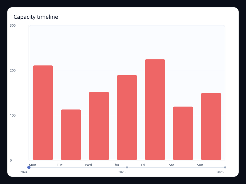
Capacity timeline uses Fission Charts typed Rust data to render a production-ready interaction view. Use it for capacity changes across time. The screenshot is captured from the native Fission chart gallery.
What the chart is for
Capacity timeline belongs to the Interaction family. Its job is to make this data shape readable: Period labels with changing chart state. In a production interface, choose this chart when the visual form makes the user's question faster to answer than a table or a simpler chart would.
Avoid it when the visual form makes the user estimate more than necessary; choose the simplest chart that answers the product question.
Data model
Period labels with changing chart state. Keep the data close to the Rust type that describes it. Fission Charts is typed Rust, so each chart uses explicit series and component structs instead of string configuration hidden in a loosely typed object.
Rust API
| Field | Type | Notes |
|---|---|---|
title | &str | Names the chart for the screen, accessibility tree, and test output. |
series | Series | Provides the typed data model for this chart family. |
width / height | f32 | Optional fixed size; omit them when the chart should flex inside Fission layout. |
Example
use fission_charts::{Axis, BarSeries, Chart};

let chart = Chart::new()
    .title("Orders")
    .x_axis(Axis::category(vec!["Q1", "Q2", "Q3", "Q4"]))
    .y_axis(Axis::value())
    .series(vec![BarSeries::new("Orders")
        .data(vec![120.0, 156.0, 184.0, 212.0])
        .into()]);
Interaction and animation
Charts can emit typed ChartInteractionEvent values when interaction is enabled. Handle those events in a reducer when the app needs hover, press, release, scroll, selection, or brush behavior. ChartAnimation stores duration, delay, stagger, easing, and reduced-motion behavior as deterministic chart data, so animation timing can be tested instead of being hidden in ad-hoc timers.
Testing guidance
For this chart, test the data mapping first, then test lowering, then capture a live screenshot when visual output changes. The screenshot for this page is refreshed with npm run charts:generate from the website package.
Tags: timeline, capacity.