Dataset and dynamic
The Dataset and dynamic family contains 16 renderer-backed chart variants. Use this page as the entry point for choosing the right variant, then open the variant page for the screenshot, data shape, Rust API notes, and example code.
The chart family is still ordinary Fission UI. Each variant is constructed from typed Rust data, participates in layout and theme decisions, and can be driven by app state, reducers, resources, jobs, or services just like any other widget.
Variants
| Chart | Data shape | Use when |
|---|---|---|
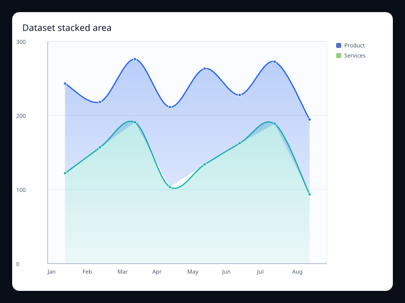
| Dataset stacked area | Several named measures sharing ordered categories. | Use it when the data pipeline should stay visible instead of hidden in chart-specific arrays. |
| Dynamic alert scatter | Small list of highlighted x/y samples. | Use it when outliers or active alerts need immediate attention. |
| Dynamic brush scatter | Point samples plus a brush rectangle. | Use it when users need to select a region before drilling into data. |
| Dynamic pictorial units | Category labels plus numeric values and a symbol choice. | Use it for unit counts that benefit from a branded or icon-like visual form. |
| Dynamic polar score | Label/value pairs mapped around a circle. | Use it for cyclic or radial score comparisons. |
| Dynamic radar health | Several same-length vectors across named indicators. | Use it for multidimensional status summaries. |
| Dynamic sales funnel | Stage/value pairs ordered by process position. | Use it when the loss between stages matters more than exact axis measurement. |
| Dynamic score gauge | Single label/value pair scaled into a gauge arc. | Use it for scorecards where the main result should be immediately visible. |
| Dynamic single-axis events | Position/value pairs on one continuous axis. | Use it for timelines or compact event strips. |
| Dynamic speed gauge | Single label/value pair in a known range. | Use it for operational status values where one number dominates the view. |
| Dynamic toolbox line | Ordered samples plus toolbox action configuration. | Use it when zoom, brush, restore, and export controls belong with the chart. |
| Encoded bars dataset | Records with category, group, and numeric value fields. | Use it when chart code should name fields once and reuse them across bar variants. |
| Encoded lines dataset | Records with ordered label, measure, and series fields. | Use it when the same dataset powers several line views. |
| Visual map calendar | Date/value pairs over a calendar range. | Use it to show daily volume, incidents, or activity in a compact year-like shape. |
| Visual map heatmap | Grid cell coordinates with numeric intensity. | Use it for dense comparisons where color communicates rank faster than labels. |
| Visual map scatter | Triples of x, y, and magnitude values. | Use it when density and magnitude both matter. |
Choosing within this family
Start with the user's question, not the visual effect. Pick the simplest variant that makes the answer clear, add interaction only when it reduces work for the user, and keep animation purposeful enough that it explains a change rather than decorating the page.